Chapter 7 of 11
Landing Pages for Paid Traffic
Paid traffic arrives with a promise already in mind. Why product pages fail that traffic, what a landing page must do instead, and when not to build one.
Contents
Everything in Chapter 5 assumed a visitor who arrived with some intent of their own. They searched for something, or they came back, or a friend sent them.
Paid social traffic is not that. Someone was watching videos, saw an ad, felt something, and tapped. They arrive with a promise in their head that your ad put there, and about three seconds of patience.
This is why the same store can have a healthy site-wide conversion rate and a paid social channel converting at a fifth of it. It is usually not the audience. It is the landing experience.
Why product pages fail paid traffic
A product page is built for someone who already knows roughly what they want. It leads with the object.
Paid traffic does not want the object yet. They want the thing the ad promised, which is almost always an outcome, a problem solved, or a feeling. Landing them on a page that opens with a photo, a name, a price, and a button asks them to make a purchase decision before they have been given a reason.
Three specific failures:
The promise disappears. The ad said “stop your dog pulling on walks.” The product page says “Trail Harness, Charcoal, $68.” Nothing on that page repeats the promise. The visitor cannot tell whether they are in the right place, so they leave. This is the most common and most fixable failure in paid ecommerce.
No context for the price. Search traffic knows what this category costs. Cold social traffic does not, and $68 is meaningless without a frame. A product page rarely provides one.
Objections arrive in the wrong order. A cold visitor’s first objection is “does this actually work,” not “which colour.” The product page answers colour immediately and works much further down, if at all.
Message match
The single highest-return concept in paid landing pages, and it is not complicated.
Whatever the ad promised should be visible on the landing page without scrolling, in words close to the ad’s own words.
If the ad’s hook is “stop your dog pulling on walks,” the landing page headline is about pulling on walks. Not “Premium Trail Harness.” Not “Engineered for Adventure.” The visitor should be able to confirm in under a second that they landed where the ad said they would.
This extends past the headline:
Visual match. If the ad was UGC shot on a phone in a park, and the landing page opens with a studio product shot on white, the visual register breaks even when the words match. Use a frame from the ad creative as the hero image. It is not lazy, it is continuity.
Tone match. A blunt, funny ad landing on formal brand copy is a mismatch even if both are good. The visitor cannot articulate what went wrong, but the sense of having been handed off to a different company is enough to lose them.
One promise per page. If you run five angles, you need pages that speak to those angles, not one page trying to satisfy all five. This is the actual argument for landing pages over product pages, and it is why ad accounts with many creative angles get disproportionate returns from this work.
A practical audit that takes ten minutes: put your top five ads and their landing pages side by side on one screen. Read the ad hook, then read the page headline. If a stranger could not match them up, you have found where your paid budget is going.
The offer beats the page
Before any layout work, the uncomfortable truth about landing pages: the offer is worth more than everything else on the page combined.
We have watched carefully constructed pages lose to plainly worse pages carrying a better offer, repeatedly. Layout, copy, and proof can win you the percentage points at the margin. The offer decides the order of magnitude.
By “offer” we do not mean discount. We mean the whole proposition:
What they get. A single product is an offer. A bundle is a different offer. A starter size at a lower entry price is a different offer again, and for cold traffic it is frequently a much better one, because the barrier is risk rather than price.
What it costs, including shipping. Free shipping at a threshold is a different offer from free shipping always, and both are different from $6 shipping.
What happens if they are wrong. A 30-day return window and a 365-day guarantee are materially different offers with the same product behind them.
How long it takes to arrive. Two-day delivery is part of the offer, not a logistics detail.
The practical instruction: before you spend three weeks rebuilding a landing page, spend a week testing whether a different offer changes anything. Bundle against single. Starter size against full size. Free shipping against a threshold. These are usually configuration changes rather than builds, they produce far larger effects than layout changes, and the effects are big enough to detect on modest traffic, which matters given the sample size arithmetic in Chapter 4.
The corollary is a caution. If your offer is genuinely uncompetitive in your category, a better landing page will not rescue it. It will just measure the problem more precisely.
Structure that works for cold traffic
The order that works, roughly, for cold paid traffic on mobile:
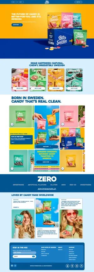
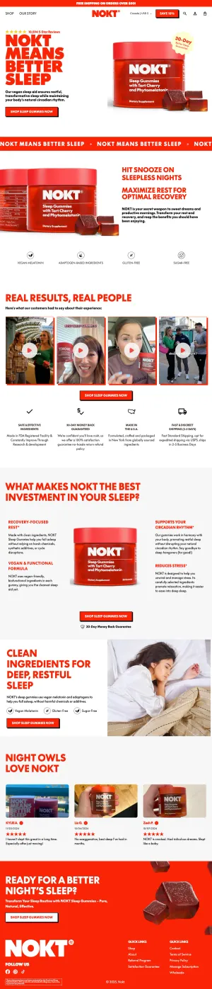
1. The promise, restated. Headline matching the ad. One sentence of support underneath.
2. Proof it is real, immediately. Not a star rating. A specific, credible artifact: a customer video, a before-and-after, a number with a source. Cold traffic’s first question is whether this works, so answer it in screen one rather than screen four.
3. The mechanism. Why it works, in one short section. People buy things they understand. Two or three sentences and one image is usually enough; this is not a whitepaper.
4. The offer, plainly. What you get, what it costs, what shipping costs, when it arrives. No hunting.
5. Objection handling. The top three from your review mining in Chapter 2, addressed directly rather than defensively.
6. Risk reversal. Return policy in plain words near a buying button.
7. A second buying opportunity. People who scrolled the whole page and are now convinced should not have to scroll back up.
Repeat the buying action roughly every screen and a half after the proof section. On a long cold-traffic page that is three or four instances of the same button, and that is correct.
Strip the navigation, but not the exits. A landing page with a full site header invites people to wander into your collection pages and out of the funnel you paid for. Remove it. What you must keep is everything that answers a question: shipping, returns, contact. Removing the header is about focus; removing the ability to check your return policy is about hiding, and customers can tell the difference.
On urgency: cold traffic is the most tempting place to fake scarcity and the worst place to do it, because these people have no prior relationship to spend down. Real constraints work. Invented ones get read instantly by an audience that sees forty ads a day, and the honest version (a genuine stock count, a real dispatch cut-off) tends to outperform the fabricated one anyway.
Advertorials and quizzes
Two formats that outperform a conventional landing page for cold traffic often enough to be worth knowing, and are misused often enough to be worth a warning.
The advertorial is an article that does the selling. It opens with the problem, spends most of its length on context and mechanism, and arrives at the product as the conclusion rather than the premise. It works because cold traffic that is not ready to be sold to will still read something that is about them.
It works particularly well where the product needs explanation, where the category has a lot of misinformation, or where the customer does not yet know a solution exists.
The line it must not cross: it has to be genuinely yours and genuinely true. An advertorial written to look like independent journalism, with a fake byline or a fabricated publication, is not a conversion tactic, it is a trust liability with a regulator attached. Label it as yours, and make it good enough that the label does not matter.
The quiz replaces a browsing decision with a series of small answers, then recommends. It works where the catalogue is large or the right choice is genuinely non-obvious: skincare, supplements, sizing-heavy apparel, anything configurable.
It works badly where the choice is easy. A four-question quiz to sell one product with two colours is friction wearing a costume, and customers recognise it immediately.
Two rules if you build one. Keep it under six questions, because completion falls off a cliff after that. And make the recommendation genuinely responsive to the answers; a quiz that recommends the hero product regardless of input gets noticed and costs you the trust the format was supposed to build.
Speed is a conversion variable here
On organic and returning traffic, speed matters. On cold paid mobile traffic, speed is a headline conversion input.
The visitor tapped an ad inside an app, on a phone, probably on cellular, with attention already leaving. Every second before content appears removes a share of them permanently, and they are shares you paid for.
The specific things that hurt, in order of how often we find them:
- Hero images that are not preloaded and not correctly sized. The single most common cause of a slow largest-contentful-paint on ecommerce landers.
- Third-party scripts in the head. Analytics, chat, reviews, personalization, heatmaps. Each one is a network round trip before your page renders. Defer everything that is not needed for first paint.
- Web fonts blocking text. Use
font-display: swapand preload the one weight you need above the fold. - Page builder bloat. Many drag-and-drop landing page tools ship 400KB of JavaScript to render what is functionally a static document.
The practical target: largest contentful paint under 2.5 seconds on a mid-range Android over 4G, not on your laptop over office wifi. Test it on the actual conditions your traffic arrives in.
This is one of the few areas where the fix is unambiguous and does not need a test. Nobody has ever run a valid experiment showing a slower page converts better.
Landing page or product page
Not every campaign needs a custom page. Building landers for everything is a good way to create fifteen pages nobody maintains.
Use the product page when: the traffic is warm or branded, the product is simple and self-explanatory, the ad was product-led rather than problem-led, or you are retargeting people who already viewed it.
Build a landing page when: the traffic is cold, the ad leads with a problem or outcome, the product needs explanation, you are testing several distinct angles, or you are running an offer that does not exist on the main site.
The honest middle path most stores should start with: improve the product page for cold traffic instead of building a separate page. Add the promise above the fold. Move proof up. Add a mechanism section. You keep one page to maintain and you capture most of the gain. Build dedicated landers once one angle is spending enough to justify a page of its own.
More worked examples of this pattern live in the landing page category.
Measuring when attribution is broken
Everything above assumes you can tell which page produced which order. Increasingly you cannot, and pretending otherwise leads to confident decisions built on bad data.
What broke. Third-party cookies are largely gone, iOS limits click identifiers, ad blockers strip pixels, and a real share of purchases happen on a different device from the click. Platform-reported conversions and your own analytics will disagree, sometimes by a factor of two, and both are wrong in different directions. The ad platform over-attributes to itself. Your last-click analytics under-attributes anything upper-funnel.
What to do about it, practically:
Use one internal source of truth for decisions. Pick your own analytics or your platform’s, and be consistent. Comparing a platform-reported number this month against an analytics number last month produces nonsense.
Watch blended metrics. Total revenue divided by total ad spend, across everything, week over week. It is crude, unattributable to any single page, and much harder to fool than channel-level ROAS.
For landing page comparisons specifically, use server-side order data. If two pages have distinct URLs, your order data can be segmented by landing page directly, which sidesteps the pixel entirely. This is usually more reliable than anything the ad platform tells you.
Run holdout tests for the big questions. Turn a channel off in one region for two weeks and watch total revenue. Blunt, expensive, and the only honest answer to “is this channel actually doing anything.”
Do not chase precision you cannot have. If two landing pages are within 10% of each other on measured performance, you do not know which is better, and picking one on that basis is superstition. Look for the differences big enough to survive your measurement error.
Testing landers when you are buying the traffic
Landing page tests have one property that changes everything: you control the traffic volume, because you are paying for it.
That is a real advantage. It also creates three traps.
Trap one: the ad platform is already optimizing. If your campaign is optimizing toward purchases, it learns which page performs and shifts delivery. Your “A/B test” now has non-random assignment, which invalidates it. Split at the page level with a proper testing tool, or run separate campaigns with locked budgets and identical audiences, and accept that the second option is noisier.
Trap two: creative and page interact. A page that wins with one ad angle can lose with another, because message match is the variable. Test page against page with the same creative, or you are measuring the combination and calling it the page.
Trap three: cheap traffic to reach significance faster. Broadening targeting to hit sample size faster changes the audience, so you have measured a different population than the one you will actually send. The result does not transfer.
The sizing arithmetic from Chapter 4 still applies, with a caveat that makes it easier: landing page changes are typically larger swings than product page tweaks, so the detectable effect is bigger and the required sample smaller. A restructured page targeting a 20% relative lift needs a fraction of the traffic of a 5% button test. This is the one place where testing on a moderate-traffic store is often genuinely viable.
Landing pages and paid media is where the work most directly touches money, which is also where most of our client engagements start. If you are spending meaningfully on paid and the numbers are not working, that conversation is free and takes twenty minutes.
Next: the last chapter, and the one almost nobody writes, which is everything that happens after the order is placed.