The redesign launched. Conversion dropped.
It was built to look new, not to convert. The numbers said so within a week.
Your ads aren’t broken. Your website is.
Shopify stores that turn the traffic you already buy into buyers. Built to be tested, not admired.
20 minutes · your numbers · no deck
| Work | Published result |
|---|---|
| Medterra rebuildBefore-and-after | $2,334,142 added |
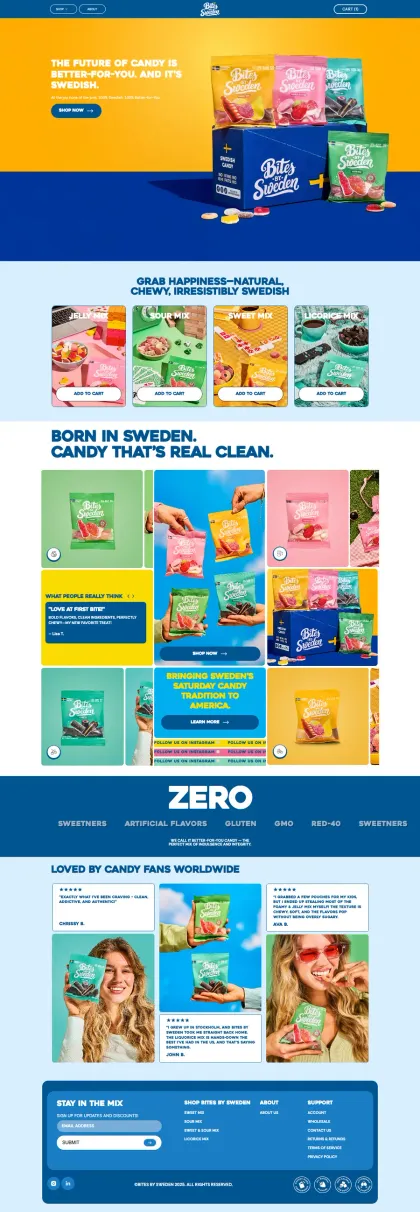
| Bites by Sweden rebuildEngagement outcome | +58% CVR, −33% CAC |
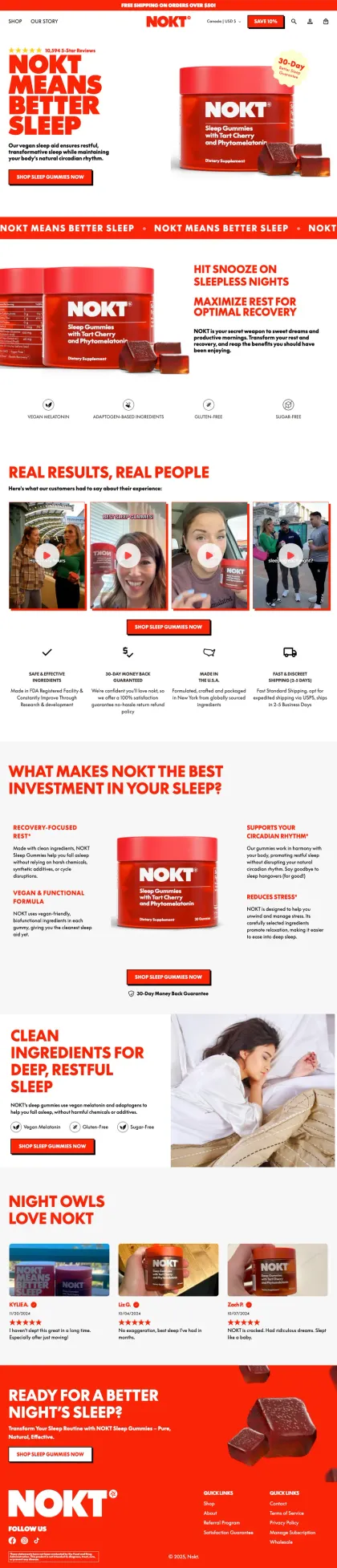
| Nokt storeEngagement outcome | 3.8% sitewide CVR |
Each row names its basis. How each is measured →
The store is the one asset every channel pays into. When it leaks, everything you spend leaks with it.
It was built to look new, not to convert. The numbers said so within a week.
Every widget promised a lift. Together they cost you the two seconds that decide a mobile visit.
The loudest voice in the room picked the layout. Nobody asked the customers who actually buy.
Fixing the leaks on the store lowers acquisition cost on the traffic you already pay for. No new ads required.
The rebuilds on this site publish lifts from +18% to +58% conversion, each labelled with what kind of evidence it is.
Every decision is backed by research, CRO principles and data, not opinions, redesign cycles or internal debates.
Sections we redesigned for real stores. Drag the line: what the page did before, and what it does now.
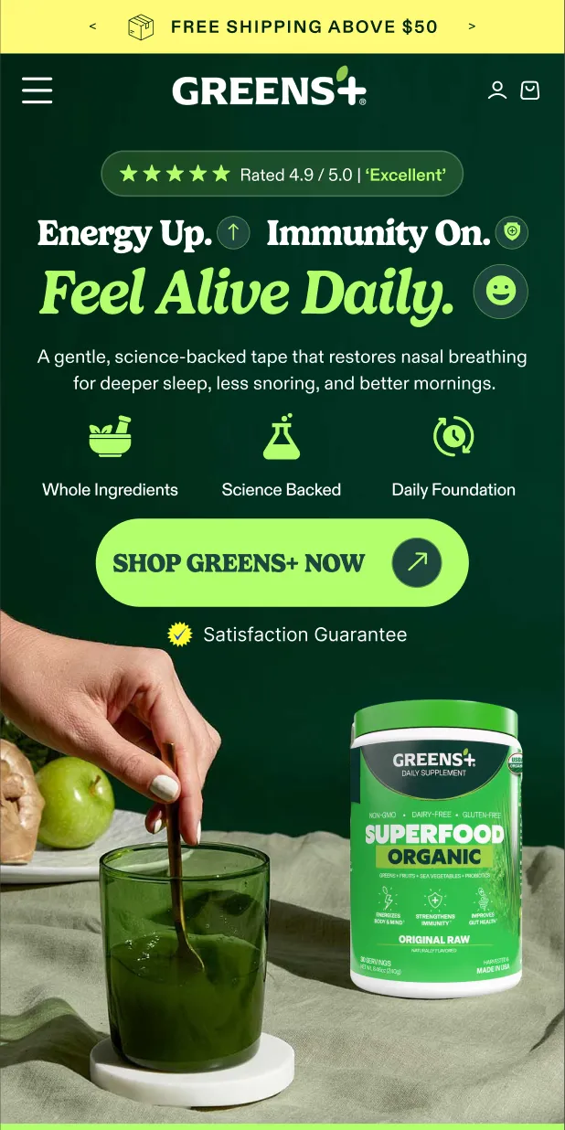

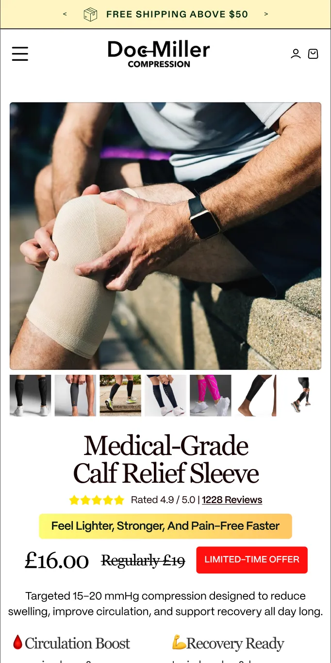
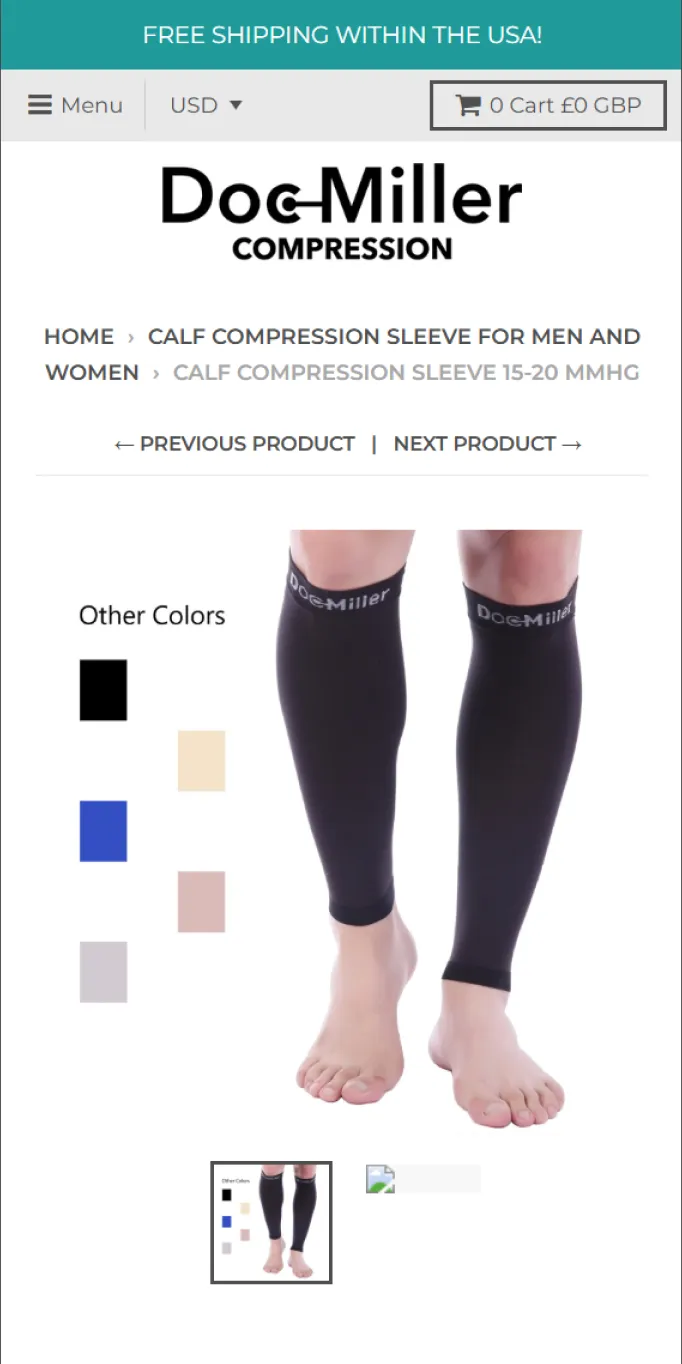
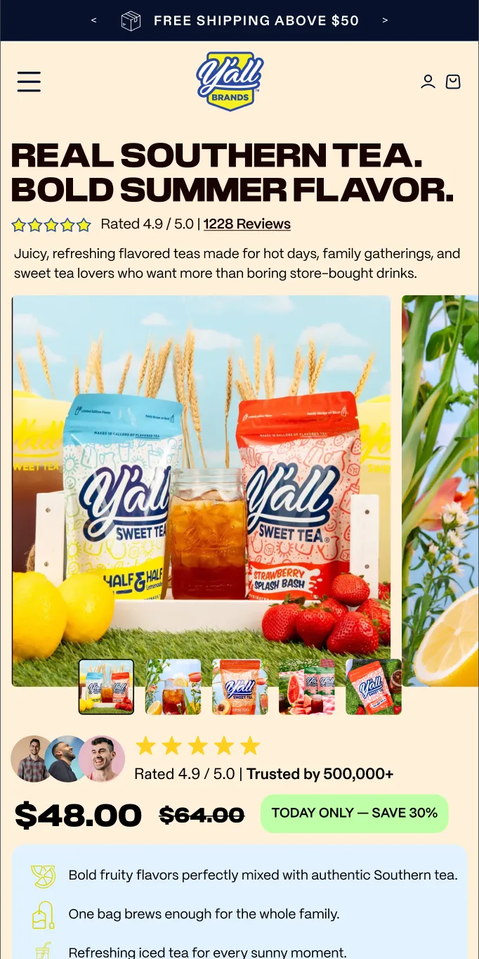
The whole screen before and the whole screen after, next to each other, with what changed in between.
Homepage hero, greens supplement
What changed
Product page buy box, compression sleeve
What changed
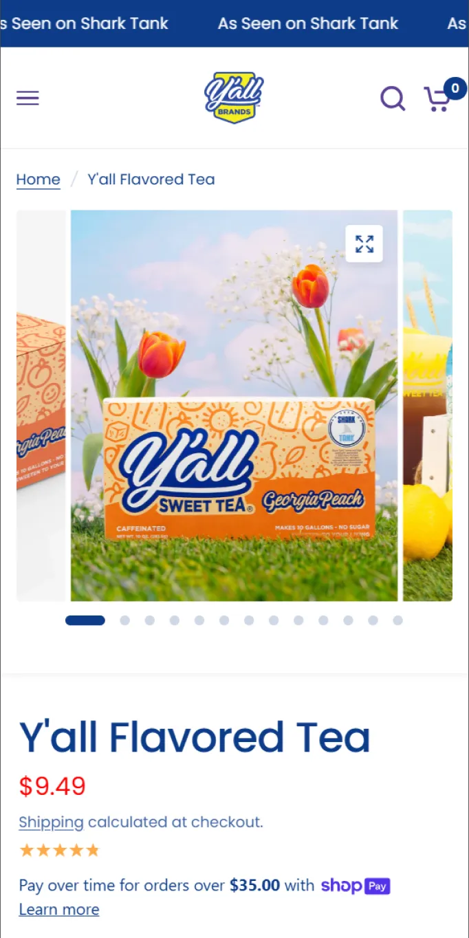
Product page buy box, sweet tea
What changed
Nothing is built until you have approved it in Figma.
Your part of the Convert Lane Loop
Offer, positioning, audience and competitive landscape: the conversion strategy built from the ground up.
You get The strategy every layout decision answers to.
A high-converting UI/UX prototype, every decision walked through with you, revised until it is fully approved.
You get An approved prototype. Nothing is built before you sign off.

The approved design built as a fully custom, editable store: fast, responsive and mobile-first across devices.
You get A live store your team can edit without breaking it.

The brand lacked clarity and cohesion. We refined the visual identity, unified the theme, and clarified their story to drive action.
Before-and-after Read the case →
Unprofitable CAC caused by weak trust and messaging. We rebuilt the site with credibility-first design and a CRO-optimized funnel.
Engagement outcome Read the case →

They struggled to connect in-clinic services with product sales. We unified messaging, rebuilt product pages, and aligned the site flow to support both.
Engagement outcome Read the case →
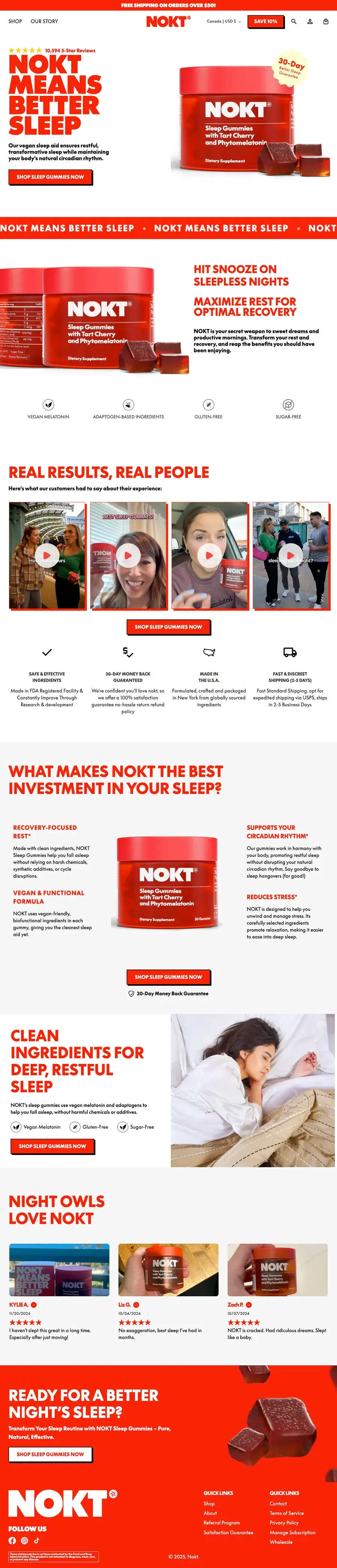
Struggling to sell a single SKU, we rebuilt the site with stronger trust signals and a CRO-focused hero PDP.
Engagement outcome Read the case →
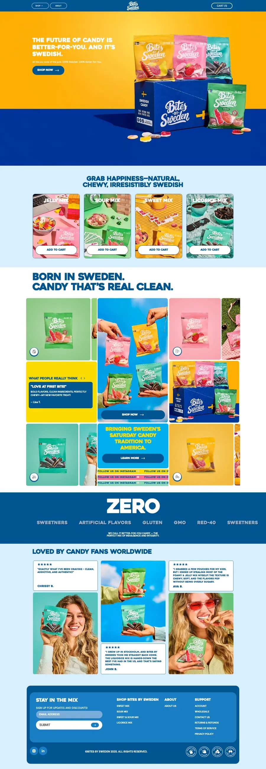
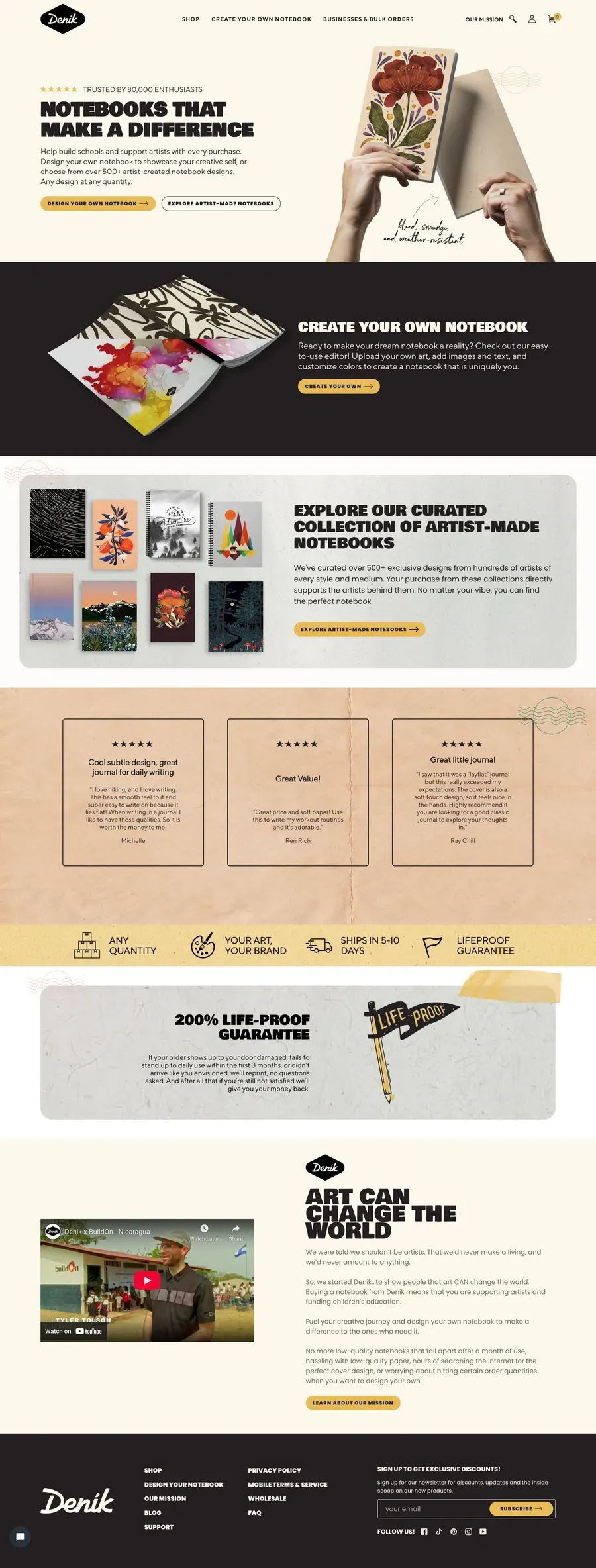
Rebuilt from the ground up: the value proposition in the first screen, and a purchase flow that stops asking people to work things out.
Engagement outcome Read the case →
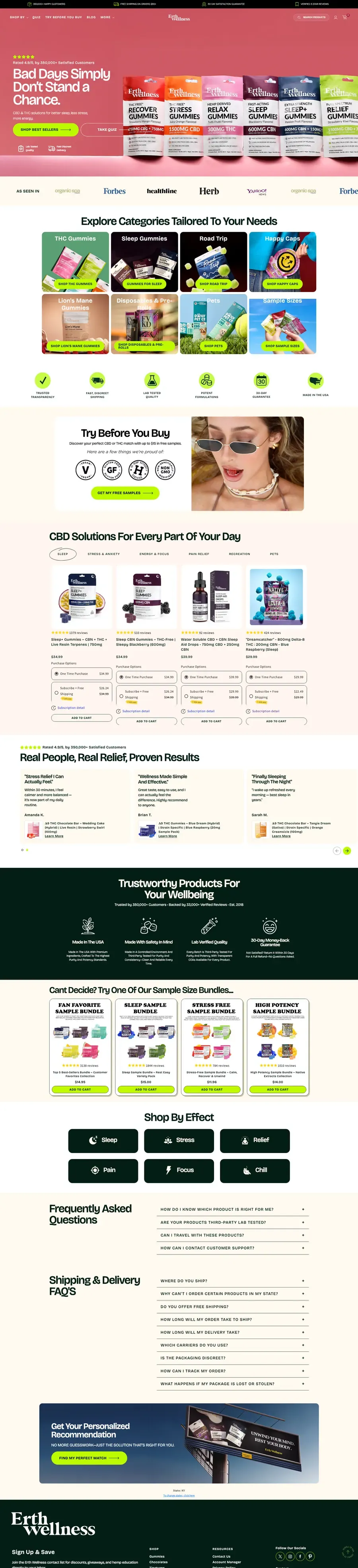
Rebuilt around the range rather than the single product, so basket size is a choice the page offers.
Engagement outcome Read the case →
Want this on your store? 20 minutes · your numbers · no deck.
Counted, and tagged with the number each piece is there to move.
Offer, positioning, audience and competitors, researched before a pixel is drawn.
Moves Conversion rate
The whole experience, with unlimited revisions until you approve it.
Moves Conversion rateAOV
Fully custom, mobile-first, built natively on Shopify. No template underneath.
Moves Conversion rateCAC
Pixel-perfect: the design you signed off is the store that ships.
Copy, imagery, sections and offers, updated without breaking the conversion logic.
Conversion rate, AOV and revenue per visitor after launch, losses included.
Moves Revenue per visitor

Out of 22 A/B tests, 14 were significant wins, generating $1,338,625 in incremental annual revenue — without increasing ad spend.

They 2X our conversion rate in the first two weeks. Kam and Solvex are magical when it comes to increasing conversions!

Every decision was tied directly to removing friction and improving performance. He quickly identified the true conversion bottlenecks.
They build the highest converting landing pages - we haven't seen a conversion rate below 3% on a Solvex page
They took our confusing offer and turned it into a story that prints sales. These guys understand CRO like nobody else.
| What | Convert Lane | DIY with AI | Freelancer / page builder |
|---|---|---|---|
| Research before design | Offer, audience, competitors, conversion gaps | No access to your data | A brief, rarely research |
| Built from buyer psychology | Message hierarchy, trust, objections | Generic best practice | Brand guidelines first |
| Approval before build | Figma, unlimited revisions | Nothing to approve | A round or two |
| Mobile first | Always; most traffic is mobile | Code you still have to ship | Often desktop first |
| Editable Shopify build | Native, your team edits it | Snippets, not a store | Usually, on a theme |
| After launch | Results reported, tests on top | Nothing happens | The engagement ends at launch |
Shopify brands at $1M–$10M a year whose store is the bottleneck.
This is for you if
Not a fit if
That is the promise we can keep. Refund guarantees are promises about your outcome, and nobody can make those honestly. Our record, wins and losses, is published instead.
437+ pages and stores built · 39 of 71 tests beat control







Crafts messaging that addresses objections, builds trust, and moves visitors to take action.
Designs page layouts and visual hierarchy that guide behavior and remove friction.
Builds fast, scalable, test-ready pages and handles all technical implementation.
Analyzes performance data to confirm what’s working and what needs to change.
Coordinates the entire process, manages timelines, and keeps communication simple and clear.
In incremental CRO revenue
$30M+Added by fixing conversion leaks, not by spending more on ads.
Websites & landing pages built
437+Conversion-first builds designed, launched, and optimized for Shopify brands.
A/B tests run
2,000+What actually converted on real stores, not theory.
On the record, losses too
39 / 71Written-up tests that beat control, with all 32 losses published beside them.
Conversion strategy and research, a CRO-driven prototype in Figma with unlimited revisions until you approve it, and a fully custom, editable Shopify build of exactly that design. You are not managing designers, developers or freelancers.
Themes are generic. We build custom designs around your product, audience and funnel. Every section, layout decision and interaction is there to move a visitor toward buying, not to look good in a theme marketplace.
Yes. That is the guarantee. You approve the design in Figma, with unlimited revisions, before we build a page of it, and we walk you through why each element exists. What you sign off is exactly what goes live.
Yes. Everything is built natively on Shopify and fully editable. Your team can update copy, imagery, sections and offers without breaking the conversion logic, and you are not locked into black-box components.
Mobile first, always. The large majority of ecommerce traffic is mobile; if the mobile experience does not convert, nothing else matters.
No, because nobody can honestly promise an outcome. What we promise is the process: research first, your approval before build, results reported after launch. Our record, 39 of 71 written-up tests beating control with the losses published, is on this site instead.
What happens after you book