Your PDP Is Not Being Read. It Is Being Scanned.
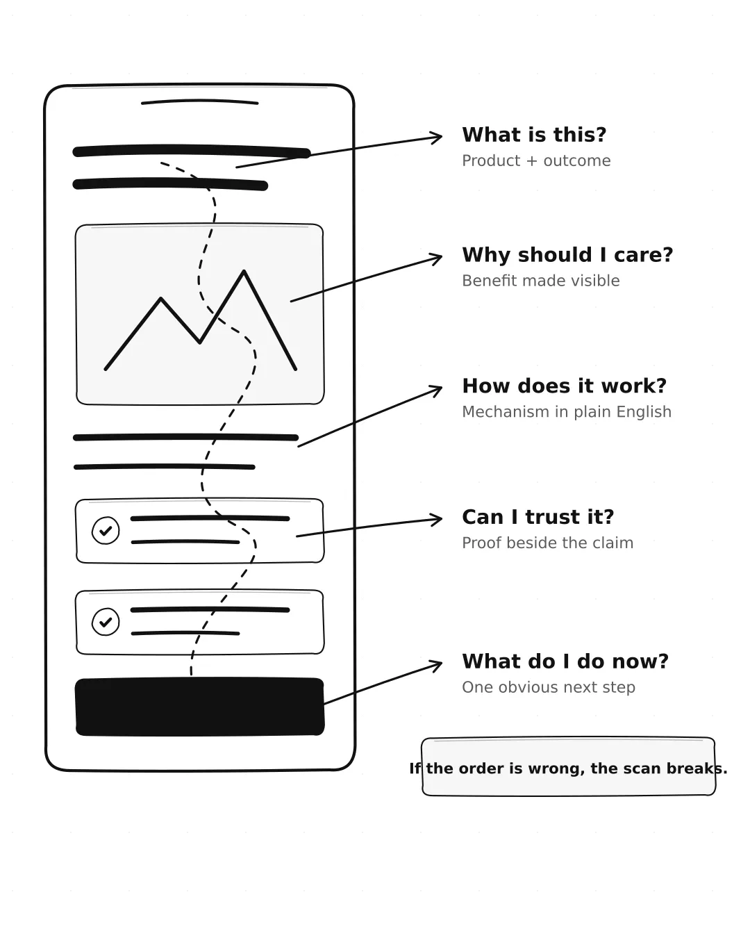
Most shoppers do not begin at the top and carefully read every sentence. They scan for answers: What is this? Is it for me? Why should I care? Can I trust it? What do I do next?
That means mobile hierarchy is not decoration. It is the order in which a shopper receives the argument. The product and core outcome should land first. Proof should appear near the claims it supports. The primary action should be obvious without forcing people to decode the layout.
The Qi uses a disciplined mobile sequence. It opens with “Drink Flowers. Feel Alive,” follows with three quick benefit cues, places the primary action early, and then moves into the product ritual. The page feels expressive, but the order is practical: outcome, benefits, action, demonstration.
Shrink your page to 25% size or blur it slightly. If you can no longer tell what matters first, your hierarchy is relying on copy instead of design.
The Qi product page, mobile, first two screens
Takeaway: Build for the shopper’s eyes, not your sitemap.
Kam
Get the next one by email
3 short examples, 2 CRO tips, 1 teardown. Every Tuesday.